

We wanted to offer ways to personalise the Twitter experience.
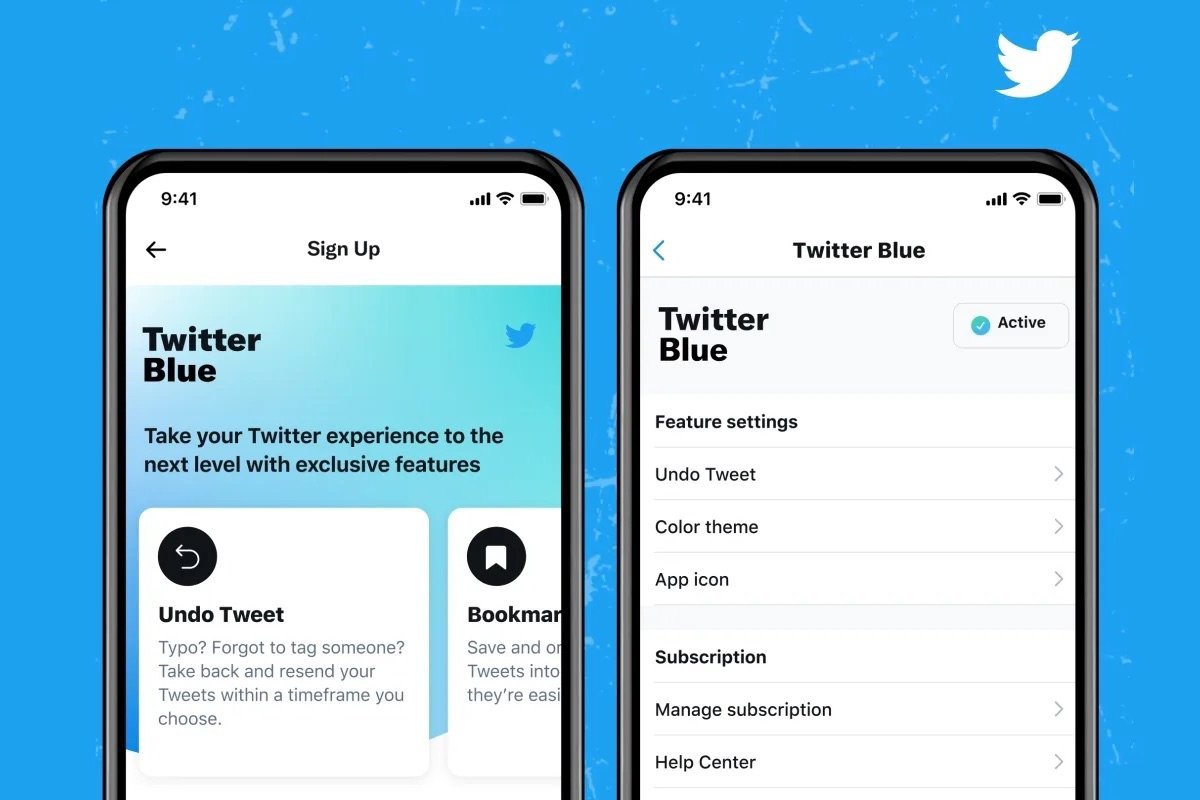
Undo Tweet, bookmark folders, undo tweet, change colour theme and navigation.
Team: Product manager, senior designer (Tegan Mierle), content designer, software engineers (iOS/ Android/ web), researchers, data scientist / Duration: 6 month (when joining the team) / Contributions: ideation, ux and converting iOS designs to Android & Web.
Find out more: here
Understanding the brief
To offer an enhanced Twitter experience for heavy Tweeters. For instance, reader mode, a toggle to read content in a seamless design when looking at threads written by journalists, writers, among other users; bookmark folders, which allowed you to organise your favourite Tweets; undo Tweet, which gave users the choice of how long they could change their Tweet before it went live; and other features like high quality videos. Additionally, I worked on the ux for the custom tab bar.
Process
As a designer this was an exciting opportunity to be creative and to visualise as many concepts as possible for iOS, Android & rWeb.
Research (Who are the users? What is the product? What are the goals?)
Document (PRD)
Collaborate and build relationships (Collaborating with a senior designer, software engineers & researchers and how to distribute work between timezones)
Design (using design systems, brainstorming on Figjam and designing on Figma)
Iterate & test (user test where possible)
Release (we would release to specific regions before going GA)
Iterate & test (gather feedback from comments about the product on Twitter and user test where possible)
The example displayed below is custom navigation. We were trying to work out what the most intuitive experience could be to customise the tab bar. For example, the home was a default that would be disabled to ensure that all users would have a quick access to the home timeline. Initially a number on the right hand corner of the selected option would show users the order in which the destinations would be presented in the navigation, and changes would be visible as they were being selected. However, with the preview being displayed as the user was selecting it was no longer necessary to have it displayed. Also, the maximum number of options presented would be displayed in an inline callout which would be triggered when the user reached the max.


What have I learnt?
I learnt the best design practices from the senior designer I was working with.
I learnt how to convert a free experience into a paying service and how to appeal to users from different regions.
I learnt how to work in a decentralised team with team members from the west coast whist in the U.K. and how to collaborate virtually.
It was great to learn what customers, including MC Hammer below, thought of the product.

